

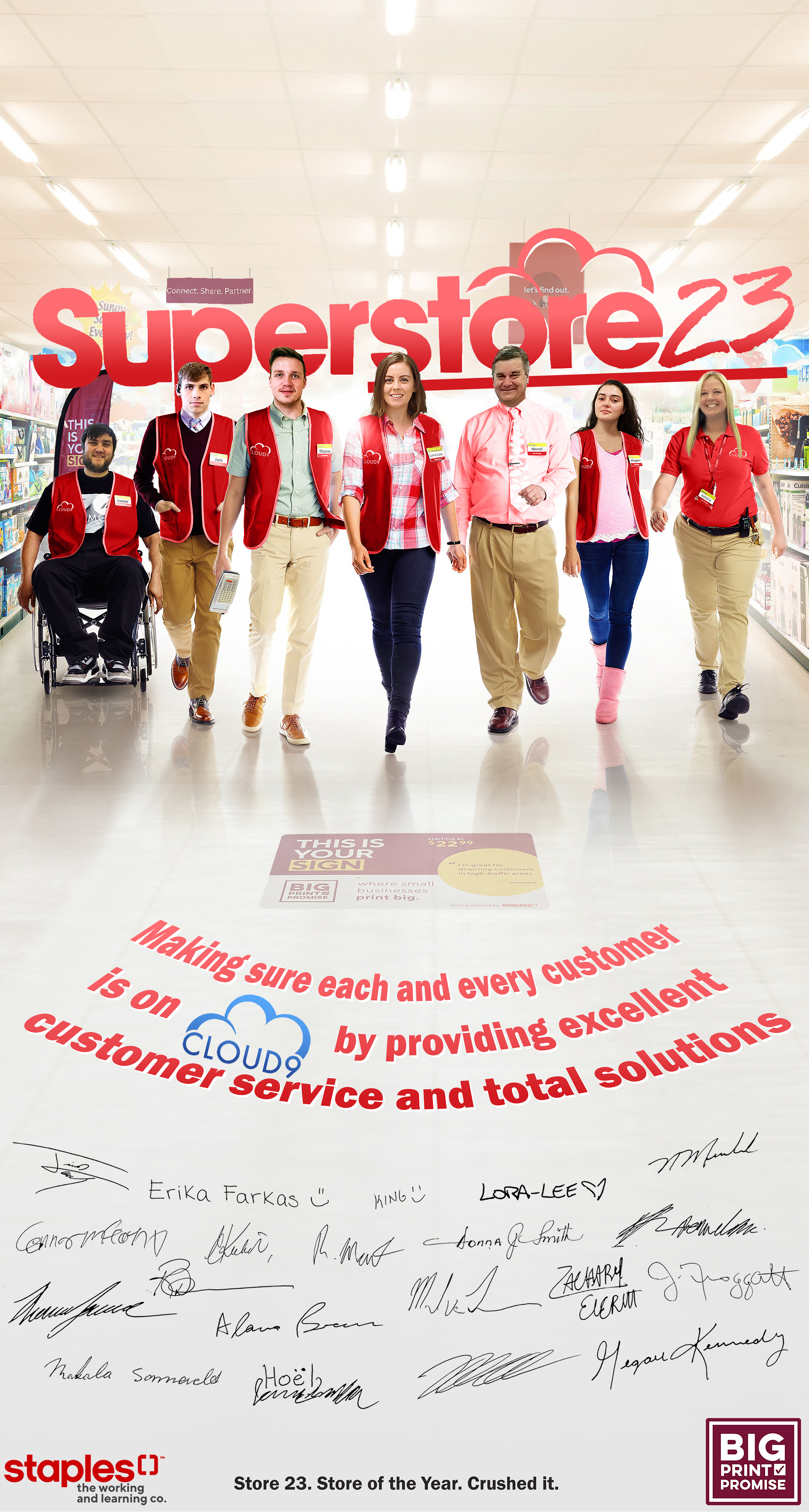
While working at Staples in Kingston Ontario I had the privileged of helping our store win a national banner creation contest. Every store in the country submitted a banner that was meant to represent what they as a store saw themselves as. Our store chose to use the show "Superstore" as our inspiration. Starting with the initial image seen below I used Photoshop to create the final product to the left. This was my most extensive dive into Photoshop yet and I learned a lot in the process and had so much fun doing it. Arguably this banner was my inspiration for looking at graphic design as a career. Learning to take something as simple as a promotional image for a TV show and turn it into a banner that has such a personal touch to it was amazing. I initially started by just replacing the colour of the blue shirts and logo with the red commonly found in the Staples Logo. I then replaced the actors' faces with those of myself and coworkers from my store. I added the 23 to the end of the Superstore logo to represent our store "23" and had to recenter the logo. The additional ceiling and flooring became a necessity to fit the contest's required banner dimensions. I then added all the personal staples touches like the hanging signage in the back, the personalized name badges, floor signage and "motto," and signatures from all the associates and coworkers from my store. The contest itself had 3 levels, the first pitted the banner against everyone in our district. Once we had won this first level we were assessed on the regional level which would be akin west, central, and east Canada. And finally the top banner from each region was judged against each other to become the national winner. This gained my store a $1000 party as well as a place for the banner to hang in the Staples headquarters in Mississauga. I couldn't be more proud of myself.